Cogncur Documentation - Didactic Features

This page gives an overview of features in the Cogncur family that can help you to create handwriting worksheets or instructional materials.

Topics:

Ensure correct line spacing

Cogncur is designed so that, at a line height of 1 (‘single’), ascenders and uppercase letters will touch the descenders from the preceeding line. Ascenders and descenders will not overlap.

Because of the potential overlap between descenders and accented uppercase letters such as Ñ, Microsoft Word will not set the line height to single when the option ‘Single’ is selected. The only way to get single line height is to set the line height to the exact same number of points that the font size is also set to. So if your font size is 24 points, you'll need to also set the line spacing to 24 points. To do this, first open the ‘Line Spacing Options’ dialog. Then set the ‘Line Spacing’ to ‘Exactly’ and in the ‘At’ field, enter the size of your current text. It’s also a good idea to set the ‘Before’ and ‘After’ spacing to 0 so that your setting also works if you go to the next line using Enter (instead of having the text ‘wrap around’).

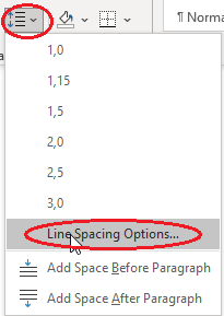
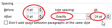
Microsoft Word: Line Spacing Options
Microsoft Word: exact line spacing


Your line spacing is set correctly if ascenders and descenders just about touch each other.
Baffling
glyphs
Correct line spacing
Baffling
glyphs
Incorrect line spacing

Font sizing guide

In US cursive curricula, what is called the 'line height' is usually the distance from the baseline to the top line, or the height of the letter l. This Graphical Guide shows what is meant by line height, and what typical line heights are in common US curricula. To match Cogncur font size to these 'line heights', use the following table:

Distance baseline - top line Cogncur font size (points)
1/4"27pt
3/8"41pt
1/2"55pt
5/8"68pt
3/4"82pt
1"110pt

For metric countries, use the table below. The waist height is the height from baseline to waist line, or the height of the lettern.
Waist height Cogncur font size (points)
2 mm17pt
3 mm26pt
4 mm35pt
5 mm43pt
6 mm52pt

Creating empty guidelines

For the time being, you should use the Cogncur Vertical font to create empty guidelines. The various characters used to create empty guidelines do not (yet) line up correctly in the Cogncur Regular and Cogncur Oblique fonts

The tilde character ~ will create a small section of guideline. Type multiple ~ characters after each other to create a section of empty guidelines, on which students can write:
You type:~~~~~
You get:~~~~~


The guidelines produced by the ~ character do not include a line for the low loops of letters like j. If your line spacing is set correctly, the next set of guidelines (on the next line) provide guidance to the low loops on the previous line. For the last line in a set of lines, you can use the 'overline' character to create (only) a top line that will serve as guidance for the low loops of the previous line. In the 'Insert Symbol' dialog, the overline character can be found after the accented charecters, in the 'General Punctiation' subset. You can also copy it from the table below:
You type: ~~~~~
~~~~~
~~~~~
~~~~~
‾‾‾‾‾
You get:
~~~~~
~~~~~
~~~~~
~~~~~
‾‾‾‾‾


Outline letters

outline letters
Outline letters are very useful when teaching handwriting. You can let students color them. You can also add (colored) arrows and/or numbers into them to demonstrate correct letter formation. Smaller outline letters can be traced by students, and to challenge your students, you can tell them they should trace exactly through the middle of the outline letter, without touching the sides.

To create (thin) outline letters from the standard Cogncur fonts, read How to create letter outlines from any font and read all the way until the end for the special notes on (connected) cursive.

If you are using Cogncur in an HTML-document, use this example on Codepen to find out how to create (both thin and thick) outlines using the CSS 'text-shadow' effect.