Unsupported accents rendered with a fallback font
calt)calt) to add the joins between letters, as well as the entry strokes and exit strokes. Contextual alternates are absolutely essential.calt'-table to invoke a set of 'single substitution'-tables. Cogncur uses the 'calt'-table to invoke a set of 'multiple substitution'-tables. As this combination of features is rare, you should test an application specifically with Cogncur before concluding that it will work with Cogncur.ssXX)ss20ss07, ss20kern)liga)ss01 (no entry strokes from the baseline) is also active.
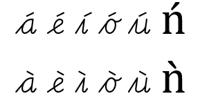
rlig)calt'-table to join them to other letters. Some renderers such as Chromium will not fall back to a default font to show unsupported characters, but will use the OpenType positioning table to 'compose' these characters on the fly. Unfortunately, characters composed by the application do not connect to other characters and do not receive entry or exit strokes, and this effect is sometimes too subtle to spot. A few (as of yet) unsupported characacters to test with, are: Ǹ ǹ Ń ń.
cg.
| name | before... (standard letters) | before... (variant letters) |
|---|---|---|
| cgi | i j p u w | p (p1) r (r1) y (y1) ij (ij1) |
| cgn | m n r v x y ij | w (w1) p (p2) p (p4) |
| cgh | b f h k l | |
| cgo | c o | |
| cga | a d g q | |
| cge | e | |
| cgs | s | |
| cgs1 | s (s1) |
|
| cgt1 | t (t1) |
|
| cgt | t | |
| cgz1 | z (z1) |
|
| cgz | z |
cgi and cgt1 are interchangeable. If one of these glyphs 'fits' as entry strokes towards a letter, the other glyph will also fit. Some stylistic sets swap these entrys trokes (as well as related joins.cgi and cgn are not interchangeable. To use a different entry stroke, a different variant of the letter glyph will be needed. This is why the letters r, w, y and z all have multiple variants.
cgz and cgn are interchangeble, but cgz has a slope that better matches the internal diagonal stroke of the letter z. The same is true for cgz1 and cgi.
ce. Some exit strokes are not used with any of the default letters, only with variant letters.| name | after... (standard letters) | after... (variant letters) |
|---|---|---|
| cen | a d h i k l m n r u x H K M R U X | p (p4) A (A2) M (M2) N (N2) |
| ceo | o | |
| cee | c e C E L | |
| cev | b v w | w (w1) |
| ceg | g j y ij G J Y | y (y1) ij (ij1) |
| ces | s | s (s1) |
| cep | p ß | p (p2) |
| ceq | f q z | f (f2) f (f3) |
| cet | t | |
| ceO | D O V W | W (w1) |
| ceB | B S | |
| ceA | A | |
| ceP | P | |
| ceF | F T | |
| ceI | I | |
| ceN | N | |
| cef1 | f (f1) |
|
| cef4 | f (f5) f (f5) |
|
| ceq1 | q (q1) |
|
| ceq2 | q (q2) |
|
| cer2 | r (r2) |
calt'-table as 'Back classes'.
| second letter in pair 🡓 | ||||||||||
|---|---|---|---|---|---|---|---|---|---|---|
| first letter in pair 🡓 | i j p r u w y z ß |
m n p r v w x y z |
b f h k l | e | a d g q | c o | s | s | t | t |
| a d h i k l m n p r t u x A H K M M N R U |
ccniaw du |
ccnnmy Un |
ccnhll nk |
ccnehe ie |
ccnadd xa |
ccnoho Ho |
ccnsis us |
ccns1is us |
ccntit ut |
ccnt1it tt |
| b v w | ccvibi vu |
ccvnwr vy |
ccvhbl wh |
ccveve we |
ccvaba va |
ccvobo wc |
ccvsbs vs |
ccvs1bs vs |
ccvtbt wt |
ccvt1bt wt |
| o | ccoioi ou |
cconon ox |
ccohof ob |
ccoeoe |
ccoaoa od |
ccoooc oo |
ccosos |
ccos1os |
ccotot |
ccot1ot |
| g j y ij G J Y y ij G J |
ccgigu Yp |
ccgngr yx |
ccghGl yk |
ccgeje ye |
ccgagg yd |
ccgoGo yc |
ccgsYs gs |
ccgs1Ys gs |
ccgtGt yt |
ccgt1Gt yt |
| c e C E L C L |
cceiei cw |
ccencr Ly |
ccehCl ef |
cceece ee |
cceaEa cq |
cceoec co |
cceses Es |
cces1es Es |
ccetet ct |
ccet1et ct |
| t | cctiti tu |
cctntr tx |
ccthth tl |
cctete |
cctata tg |
cctoto tc |
cctsts |
ccts1ts |
cctttt |
N/A |
| s s | ccsisp si |
ccsnsn sr |
ccshsh sl |
ccsese |
ccsasa sq |
ccsosc so |
ccssss |
N/A | ccstst |
ccst1st |
| p ß | ccpipi pp |
ccpnpr pn |
ccphph pl |
ccpepe ße |
ccpapa pg |
ccpopc po |
ccpsps ßs |
ccps1ps ßs |
ccptpt ßt |
ccpt1pt ßt |
| f q | ccqi, ccqj1qu fi fj |
ccqnfr fy |
ccqhff fl |
ccqefe qe |
ccqaqa fa |
ccqofo fc |
ccqsfs qs |
ccqs1fs qs |
ccqtft qt |
ccqt1ft qt |
| z f q Q Z | cczizi qu |
ccznZx fr |
cczhZh fl |
cczeze fe |
cczaza qq |
cczozo Qo |
cczszs fs |
cczs1zs fs |
ccztzt ft |
cczt1zt ft |
| f | ccf1i, ccf1j1fu fi fj |
ccf1nfr fy |
ccf1hff fl |
ccf1efe |
ccf1afa fq |
ccf1ofo qc |
ccf1sfs |
ccf1s1fs |
ccf1tft |
ccf1t1ft |
| q | ccq1iqu qi |
ccq1nqr qy |
ccq1hql qh |
ccq1eqe |
ccq1aqq qa |
ccq1oqo qc |
ccq1sqs |
ccq1s1qs |
ccq1tqs |
ccq1t1qs |
| q | ccq2iqu qi |
ccq2nqr qy |
ccq2hql qh |
ccq2eqe |
ccq2aqq qa |
ccq2oqo qc |
ccq2sqs |
ccq2s1qs |
ccq2tqs |
ccq2t1qs |
| r | ccr2iru rp |
ccr2nrr rx |
ccr2hrf rk |
ccr2ere |
ccr2ara rg |
ccr2orc ro |
ccr2srs |
ccr2s1rs |
ccr2trt |
ccr2t1rt |
| A | ccAiAu Ap |
ccAnAr Ax |
ccAhAf Ak |
ccAeAe |
ccAaAd Aq |
ccAoAc Ao |
ccAsAs |
ccAs1As |
ccAtAt |
ccAt1At |
| B S | ccBiBu Si |
ccBnBr Sy |
ccBhBb Sh |
ccBeBe Se |
ccBaBa Sq |
ccBoBo Sc |
ccBsBs Ss |
ccBs1Bs Ss |
ccBtBt St |
ccBt1Bt St |
| D O V W | ccOiOw Vi |
ccOnOn Dr |
ccOhWh Ol |
ccOeDe Oe |
ccOaVa Od |
ccOoOo Do |
ccOsOs Vs |
ccOs1Os Vs |
ccOtOt Vt |
ccOt1Ot Vt |
| F T | ccFiFj Ti |
ccFnFr Ty |
ccFhTh Fl |
ccFeTe Fe |
ccFaTa Fa |
ccFoTo Fo |
ccFsis us |
ccFs1is us |
ccFtit ut |
ccFt1it tt |
| P | ccPiPi Pp |
ccPnPr Py |
ccPhPh Pf |
ccPePe |
ccPaPa Pd |
ccPoPo Pc |
ccPsPs |
ccPs1Ps |
ccPtPt |
ccPt1Pt |
| I | ccIiIi Ip |
ccInIn Ir |
ccIhIf Ib |
ccIeIe |
ccIaId Ig |
ccIoIo Ic |
ccIsIs |
ccIs1Is |
ccItIt |
ccIt1It |
| N | ccNiNi Nu |
ccNnNn Ny |
ccNhNk Nb |
ccNeNe |
ccNaNa Ng |
ccNoNo Nc |
ccNsNs |
ccNs1Ns |
ccNtNt |
ccNt1Nt |
ccqj and ccf1q are only used to join from (some variants of) f and q towards j. All other joins towards j are identical to the correspondings joins towards i.
calt'-tables in Cogncur invoke multiple substition tables, there is no need for the font to combine letter glyphs and entry/exit/join glyphs into ligatures. ss01 to get shorter entry strokes (not from the baseline), you will get a ligature at the beginning of each lowercase word, which combines the letter glyph with the glyph for the short entry stroke (whose name starts with cs in FontForge). The reason for this is the need to decrease whitespace, and the impossibility of taking more whitespace from some of the short entry stroke glyphs.